VINYL SHOWCASE SERIES - Dichroic films

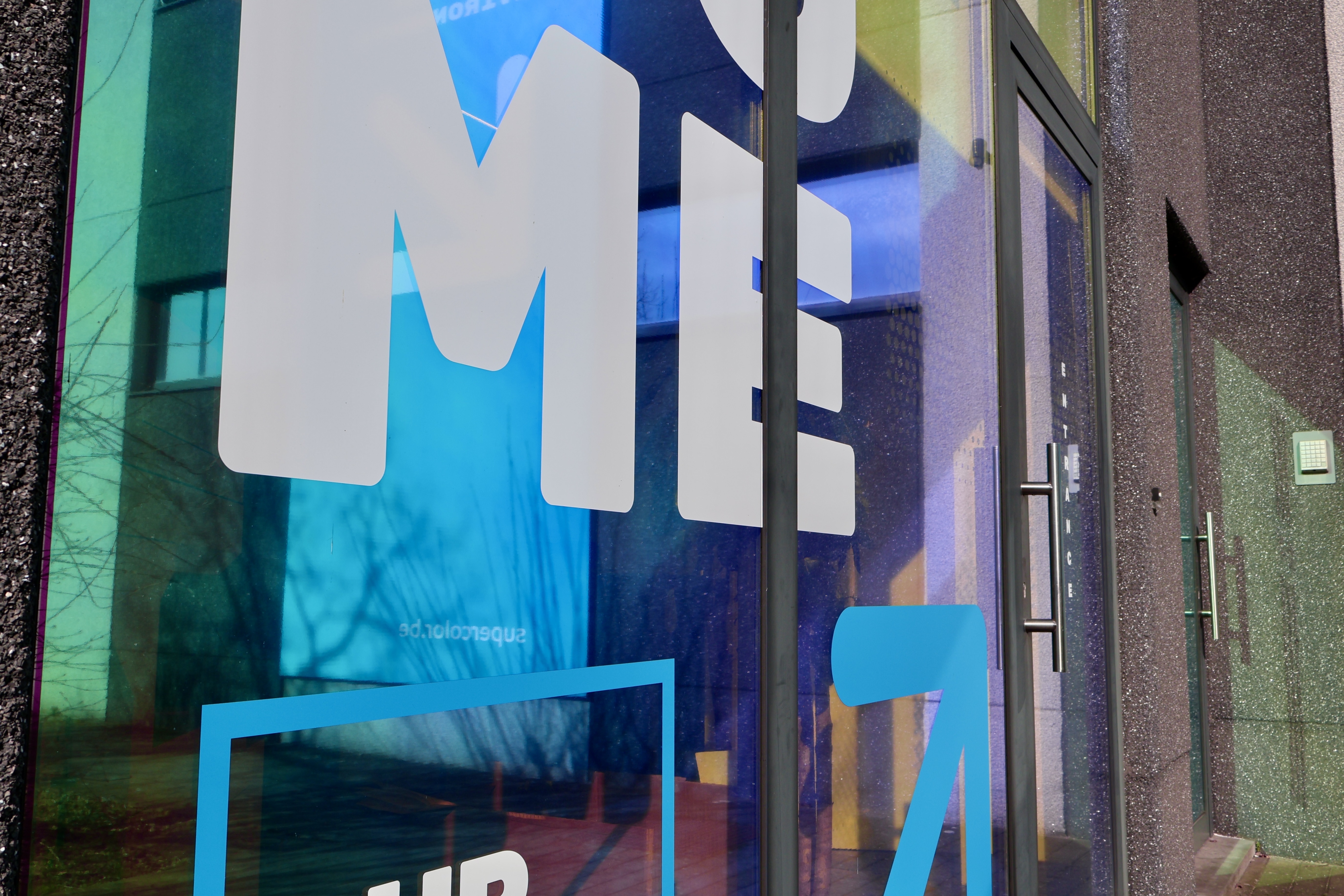
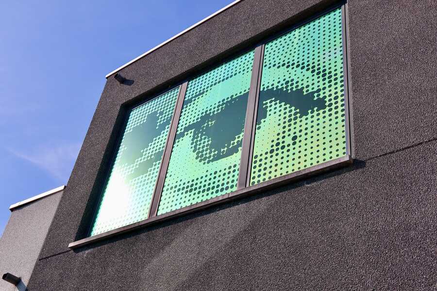
Supercolor, a leading B2B specialist in branding and signage, recently refreshed its headquarters in Merelbeke, Belgium, as part of a broader rebranding. One of their main goals? Creating a more eye-catching entrance for customers and visitors. The building is partially hidden behind trees and bushes when approaching the parking area. But now, thanks to Spectra Flame, our stunning red-pink dichroic window film, the building truly stands out!
Shifting colours to the rescue
Supercolor specializes in both interior branding and indoor and outdoor signage, serving a diverse range of businesses, particularly in the banking sector. Dichroic films are popular for their color-shifting properties and premium aesthetic, but they are often prohibitively expensive compared to alternatives.
When we introduced Spectra Flame, Supercolor immediately saw it as the perfect solution for their rebranding. Ultimately, their interior designer made the final call, recognizing dichroic film as a key element of the refreshed brand identity. The result? An eye-catching entrance that shimmers and shifts in colour, reinforcing Supercolor’s slogan: "We enhance environments.”


Blending design and branding
The use of Spectra Flame at Supercolor’s entrance illustrates the seamless integration of architecture and branding. The film was customized with Supercolor’s logo, a welcoming message, an arrow, and an eye motif, designed to create a warm, inviting appearance. Every element was thoughtfully incorporated to ensure visitors instantly recognize the brand and the entrance, while also offering a glimpse into Supercolor’s expertise in high-quality visual communication.
CEO Philippe Staelens shared his thoughts:
“It was primarily an aesthetic choice. We wanted to make our entrance more attractive and recognizable. Spectra Flame has absolutely contributed to our refreshed branding.”

Overcoming challenges
Although the design and installation process went smoothly overall, printing on polyester proved to be challenging due to its unique properties. However, with the right technique we were able to achieve great results.
"When we rubbed the film shortly after the installation, we saw tiny fragments of the print come loose. But this had little effect on the finished appearance. Yet it was an obvious challenge because this kind of material isn't made for printing. Print adhesion normally requires a coating layer, but doing so could change the film's typical appearance and we did not want that.” said Philippe.
The final result exceeded expectations. The dichroic effect became a standout feauture of Supercolor's new look.

Following their positive experience with Spectra Flame, Supercolor has already recommended it to one of their clients, a well-known retail brand, for an end-of-year display project.
"We will be doing a test installation. It’s exciting to see how Spectra Flame and Spectra Ice can be used in different creative ways, in countless sectors!”
Final verdict
Supercolor rated Spectra Flame an 8 or 9 out of 10, noting that it wasn’t the easiest product to print. Even so, in terms of visual impact and ease of use, the product met all of the requirements and expectations! Supercolor’s experience highlights how dichroic films can actually serve as a creative tool for brands looking to make a statement. It is a strong solution for architectural and signage applications because of its eye-catching colors, dynamic reflections and premium appearance. Do you want to see the magic for yourself?

